case study
UMAI TEA
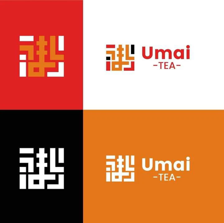
Umai Tea is a Japanese Tea Brand The logo is based on a typography of Umai うまい meaning 'Yummy' in English Language
- Client
- Umai Tea
- Role
- Brand designer
- What I did
- LogoBrand identity
The brief
Umai means "delicious" in Japanese. The brief was a tea brand that nods to East Asian tea culture without borrowing a stereotype.
How I got there
- 1
A glyph you can build
The mark is drawn on a grid, like a character made of blocks. It echoes calligraphy and seal stamps but stays geometric and modern.
- 2
Warm and loud
Red, orange, black and white. Warm colours for something you drink hot, high contrast so it pops on a cup sleeve.
- 3
Tested on everything
I set the mark on red, white, black and orange to make sure it holds up on any surface the brand might end up on.
How it landed
A flexible mark and wordmark pairing ready for cups, packaging and storefronts.
seen enough? there's more where this came from
See the full project on Behance↗