case study
Cassieglamz Branding
A warm, elegant identity for a beauty brand, with one consistent tone across every post and product.
- Client
- Cassieglamz
- Role
- Brand designer
- What I did
- Brand identityArt directionSocial
The brief
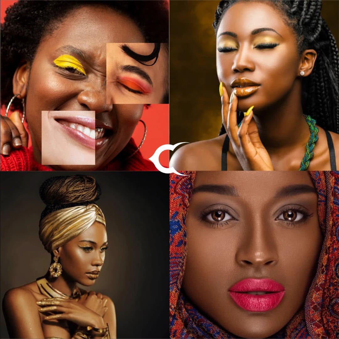
Cassieglamz is a beauty brand for women who look like its customers: melanin-rich skin, bold colour, plenty of confidence. It needed to feel warm and elegant, never clinical.
How I got there
- 1
Warm palette, always
Golds, deep browns, rich reds and warm pinks, the colours that flatter darker skin. Nothing cold, nothing grey.
- 2
Art direction is the identity
For a beauty brand, the photos are the brand. I set one consistent look: close crops, glowing skin, gold accents and collage layouts that feel editorial.
- 3
A quiet mark
The crescent C sits lightly over the imagery so the faces and the colour stay the focus.
- 4
One tone everywhere
Every post, story and flyer follows the same rules, so the feed reads as one brand, not a mood board.
How it landed
A visual language that lets Cassieglamz post every day without ever looking off-brand.
seen enough? there's more where this came from
See the full project on Behance↗