case study
OOL Charters Posters
A social poster series for OOL Charters, a luxury charter service for cars, private jets and yachts.
- Client
- OOL Charters
- Role
- Visual designer
- What I did
- PostersPrintMarketing
The brief
OOL Charters rents premium cars, private jets and yachts. Three very different services, one brand, and an audience that scrolls past luxury ads all day. The posters had to feel premium without feeling cold, and make each service instantly recognisable.
How I got there
- 1
Spell the brand with the product
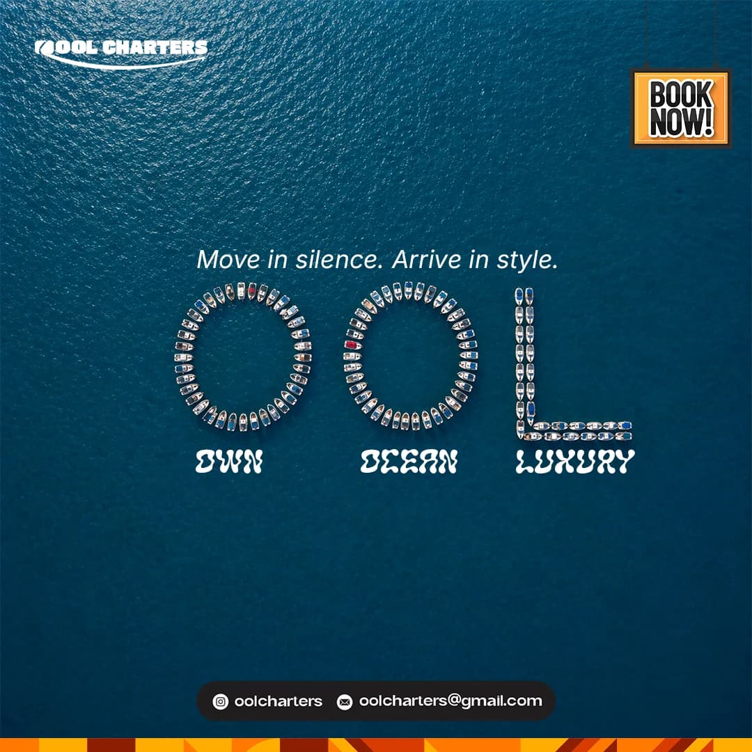
The newest poster, "Own Ocean Luxury", writes O-O-L in a fleet of boats seen from above on deep blue water. It turns the logo into the service itself, and it reads in a split second in a feed.
- 2
One headline, one idea
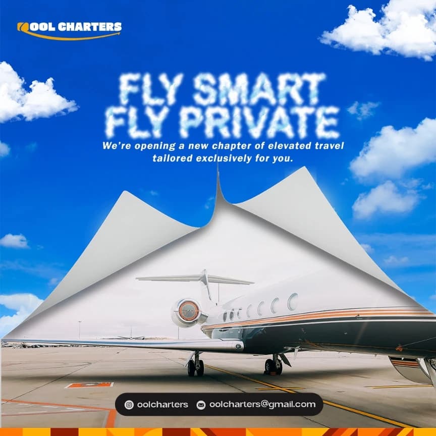
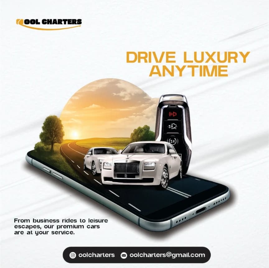
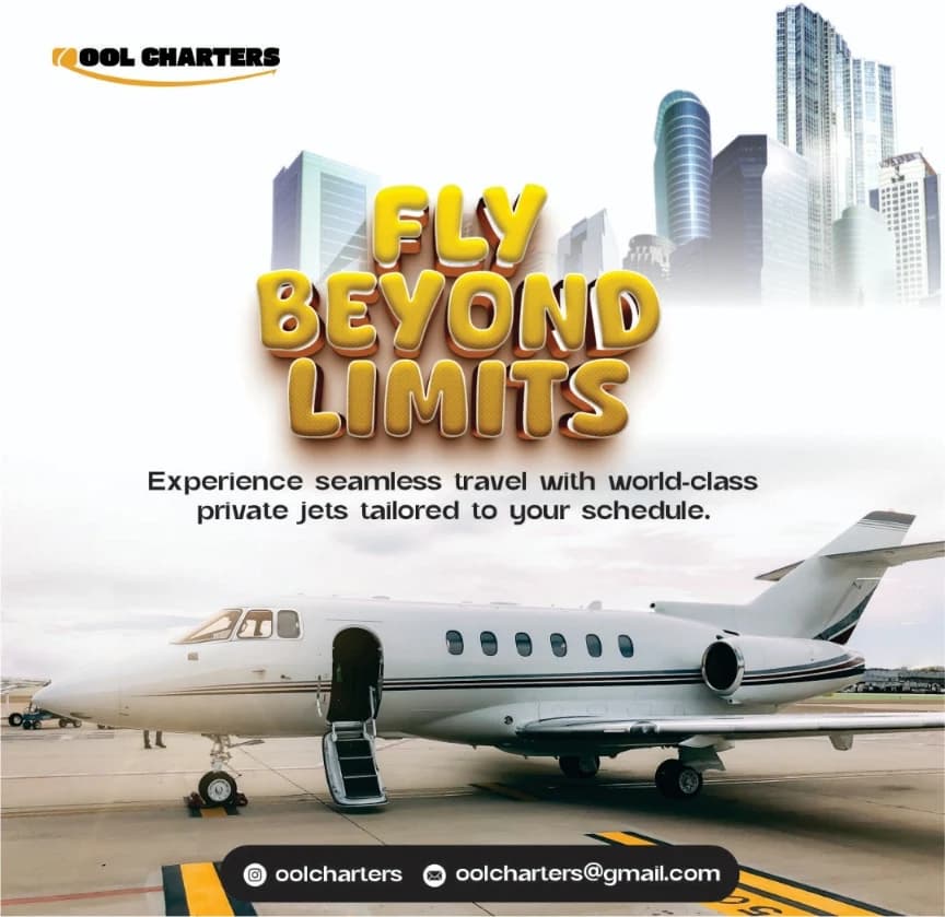
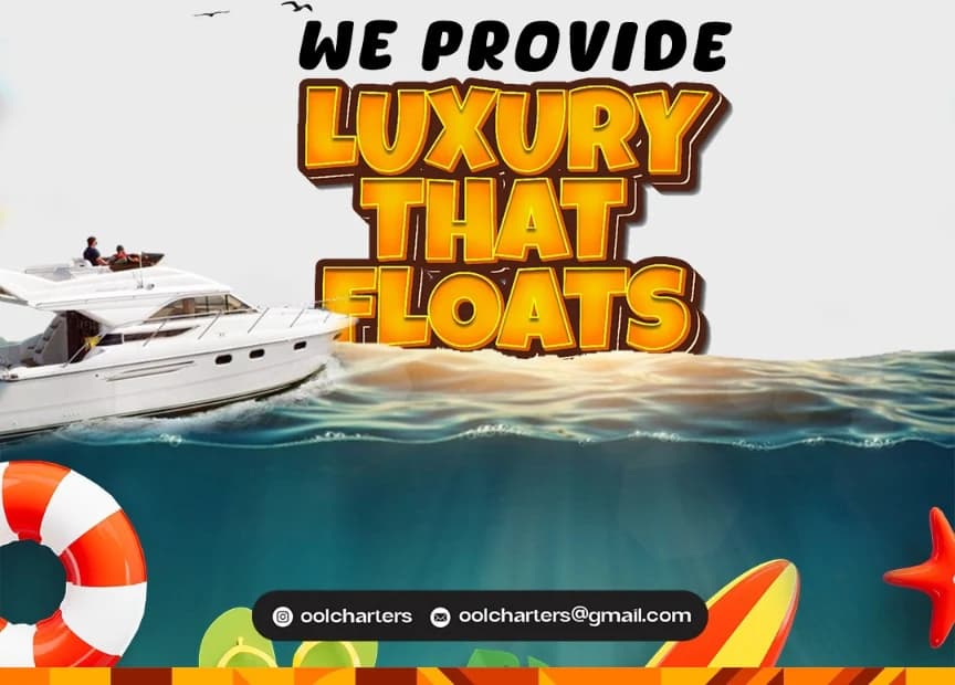
Every poster leads with a short, loud line: "Fly smart, fly private", "Drive luxury anytime", "Fly beyond limits", "Luxury that floats". You get the offer before you've read a word of body copy.
- 3
Each service gets its own world
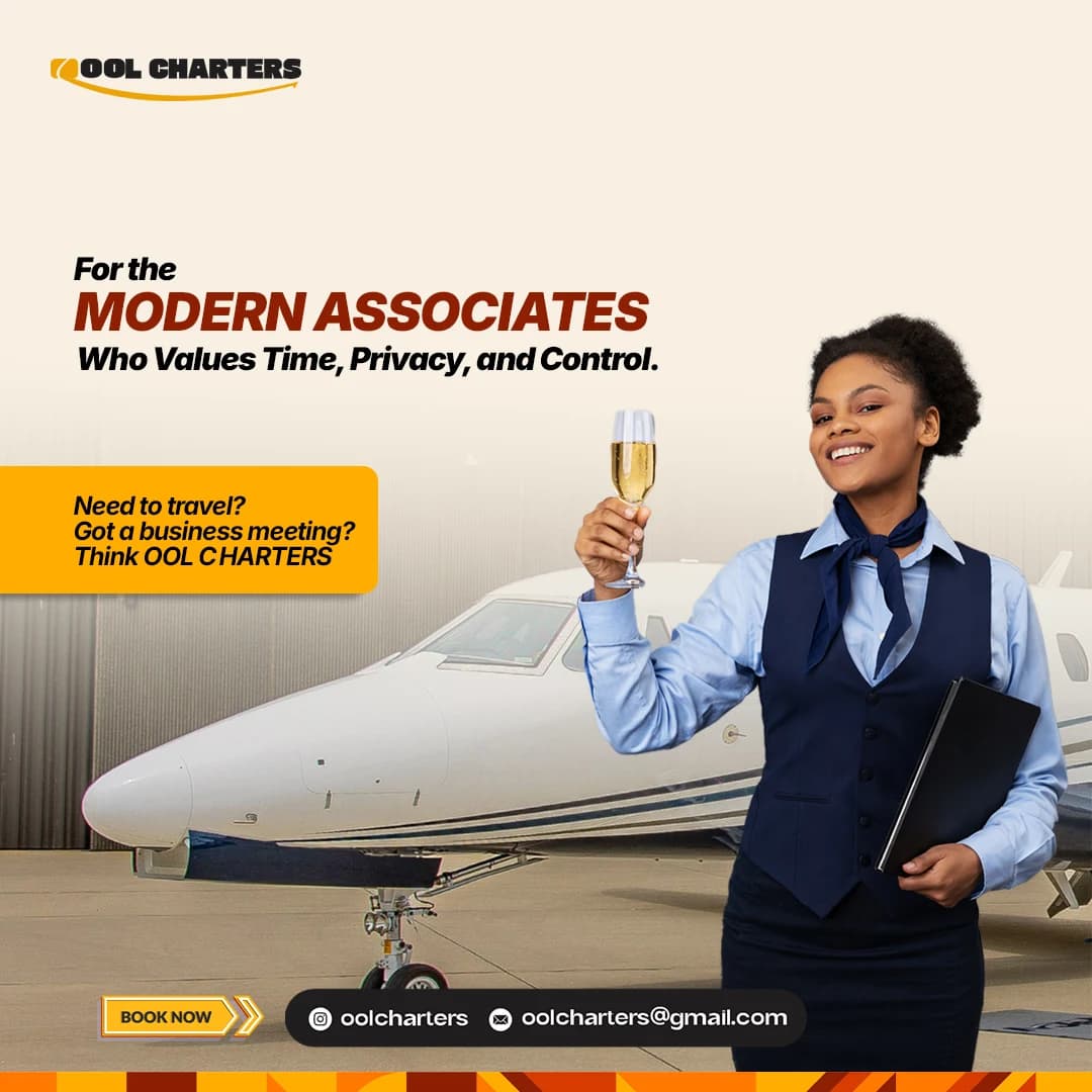
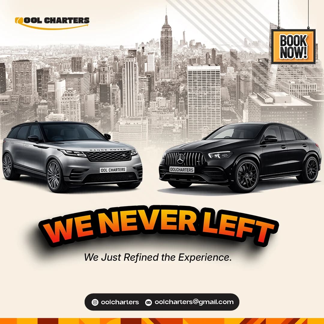
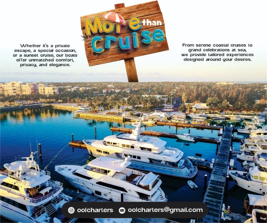
Jets get open sky and runways, cars get city skylines and an open road on a phone screen, yachts get water and a marina at golden hour. Same brand, but you can tell which service it is from the thumbnail.
- 4
Play with the type
The lettering does some of the storytelling: a car sits inside "Bridge", "More than cruise" is a beach signboard, and "Luxury that floats" is set in chunky gold over the sea.
- 5
Same footer, every time
The logo top-left and the handle and email bar at the bottom never move, so the set reads as one brand on the grid and people always know where to book.
Up close

How it landed
A nine-poster set across all three services, from the launch-era headlines to the newer "We never left" refresh, that stays consistent on the grid and always shows people how to book.
seen enough? there's more where this came from
See the full project on Behance↗