case study
Groovvee App Launch
Launch design for Groovvee, an all-in-one entertainment platform. Handled all designs from wireframes through final screens, backed by user research and usability testing.
- Client
- Groovvee App, Minneapolis (remote)
- Role
- UI/UX designer
- Year
- 2023–2024
- What I did
- User researchUI designPrototypingLaunch creative
The brief
Groovvee wanted games, live streams, podcasts, movies and music in one app. That's five apps' worth of content fighting for one screen. My job was to make it feel like one place, not five tabs stapled together.
How I got there
- 1
Start with the people
Before drawing anything I ran research and usability tests with 30+ users. The pattern was clear: people didn't want to browse, they wanted to land on something good quickly. That's why the home feed leads with stories and recommendations instead of a wall of categories.
- 2
One yellow to hold it together
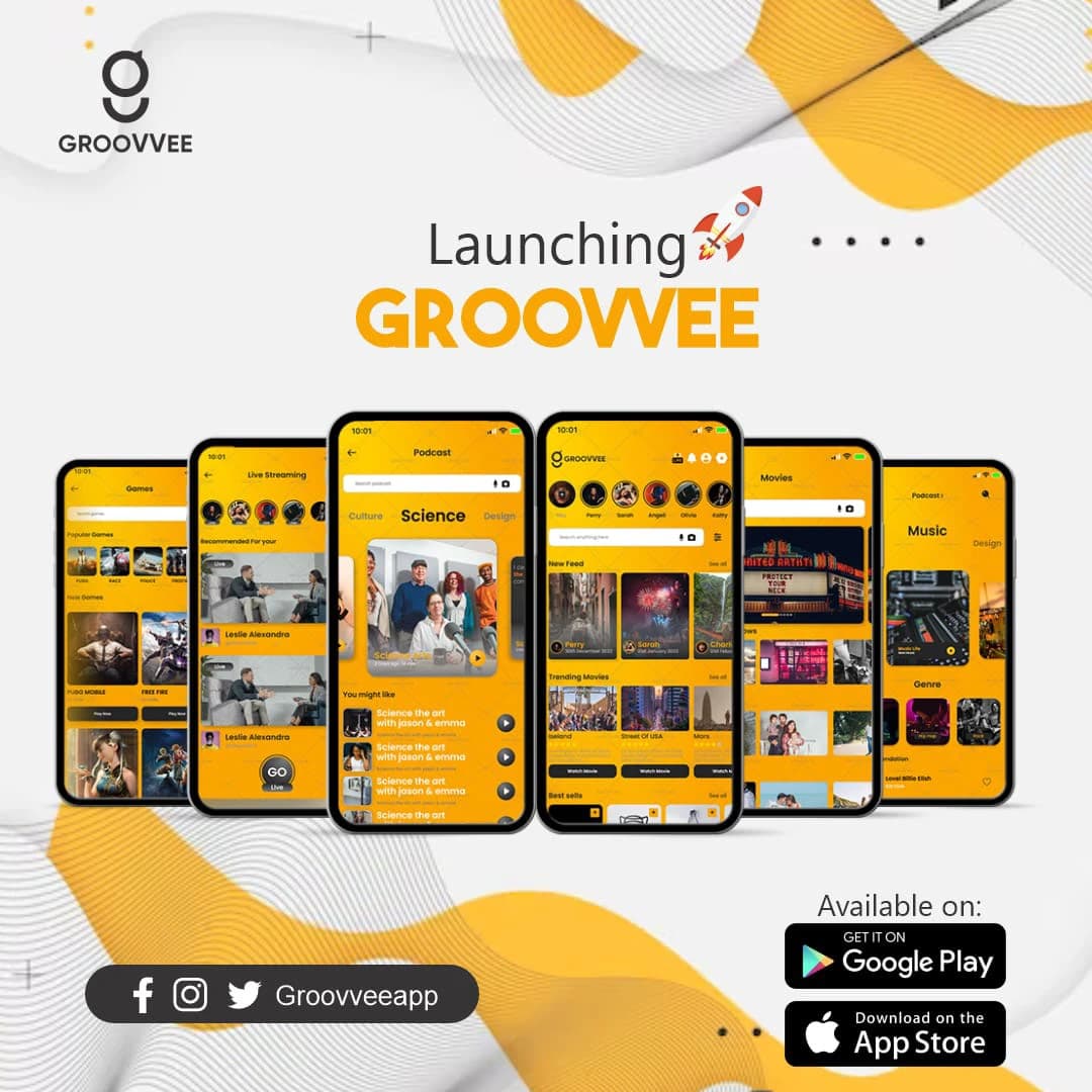
Each content type has its own layout, but they all share the same yellow, the same cards and the same search bar at the top. Jump from Podcasts to Movies and nothing about how you move around changes.
- 3
Wireframes to final screens
I took it from rough wireframes to final screens in Figma, testing as I went, and worked with the engineers so what shipped matched what we designed.
- 4
Launch it loud
For launch I made the "Launching Groovvee" creative: six real screens fanned out like a hand of cards, so people could see the range of the app in one image.
How it landed
Groovvee launched on Google Play and the App Store. Testing early caught the friction points while they were still cheap to fix, so engineering wasn't stuck rebuilding screens later.
seen enough? there's more where this came from
See the full project on Behance↗