a personal one ✦
Gripd: Lifecycle Emails
Four emails that sound like a friend who's good with money, not a bank statement.
- Client
- Personal project
- Role
- Everything
Why I made it
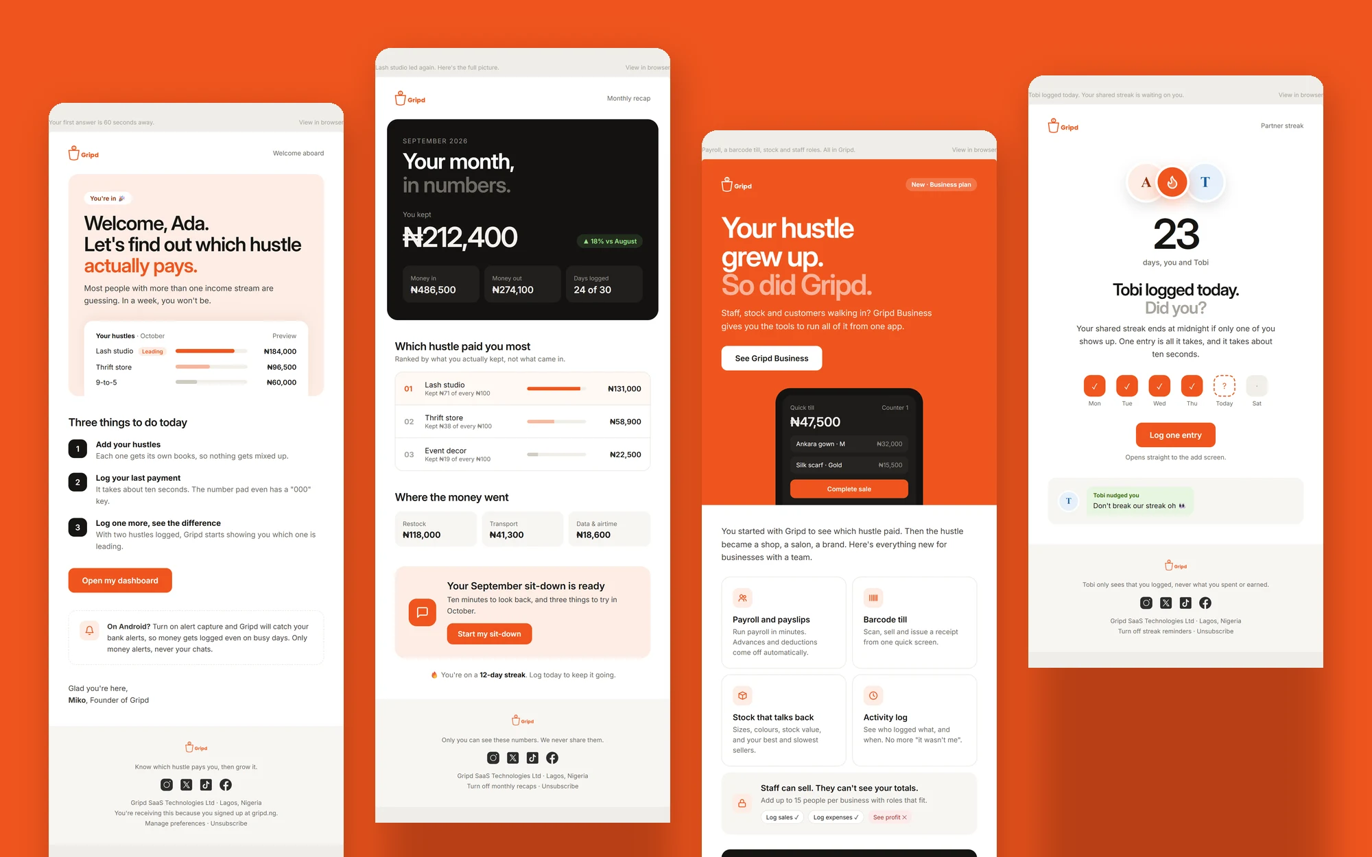
Most fintech emails are either a wall of legal text or a discount code shouting in caps. Gripd talks to people juggling more than one hustle, and I wanted the inbox to feel like the app: warm, a bit cheeky, and always answering the one question users actually care about, which hustle is paying. So I designed the four emails that matter most in a user's first few months and built them as real HTML, not just pictures of emails.
How I got there
- 1
Welcome: show the answer first
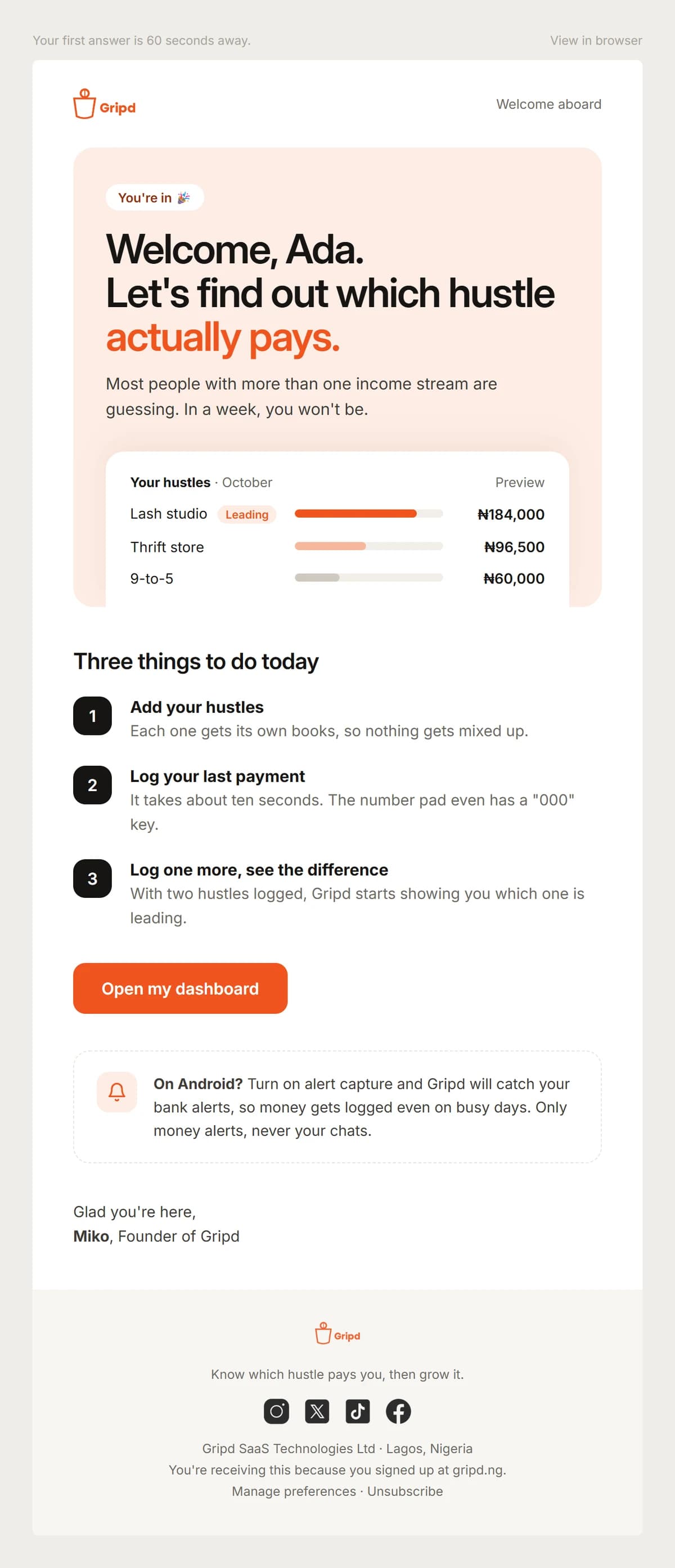
"Welcome, Ada. Let's find out which hustle actually pays." Instead of a feature tour, the welcome shows a preview of what their dashboard will look like (lash studio leading, thrift store second, the 9-to-5 third) and three small things to do today. The preheader does the selling: your first answer is 60 seconds away.
- 2
Recap: the month, in one number
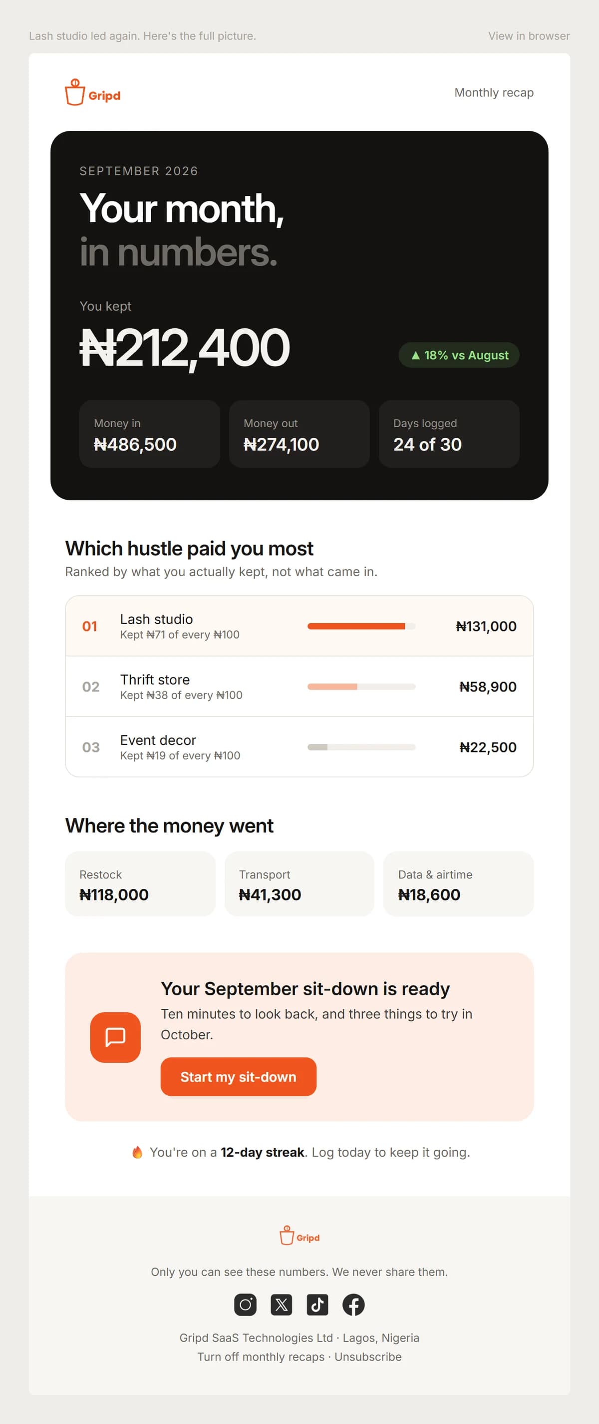
The monthly recap leads with what you kept, not what came in: ₦212,400, up 18% on August. Then the hustles ranked by profit, with a 'kept ₦71 of every ₦100' line under each, because that's the number people never work out for themselves.
- 3
Launch: the hustle grew up
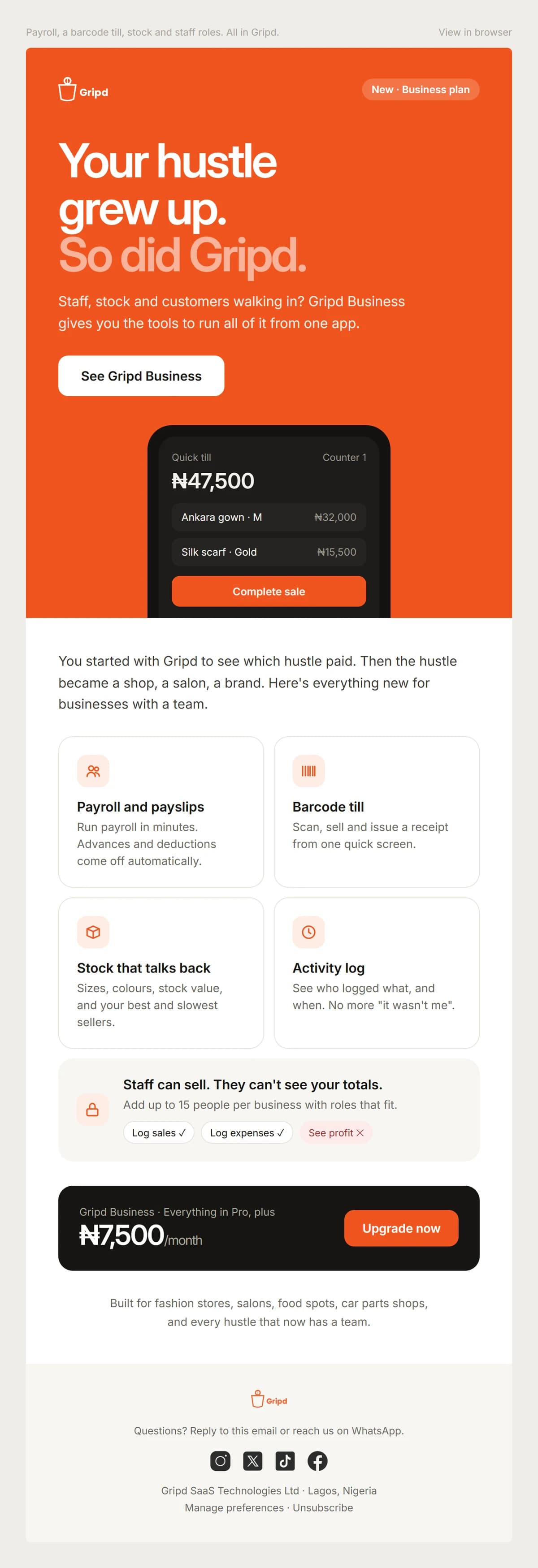
For the Business plan, the whole hero goes Gripd orange: "Your hustle grew up. So did Gripd." A phone showing the quick till, a bento of the new features (payroll, barcode till, stock, activity log) and a plain price block at ₦7,500 a month. No countdown timers, no fake urgency.
- 4
Streak: a nudge from a person, not the app
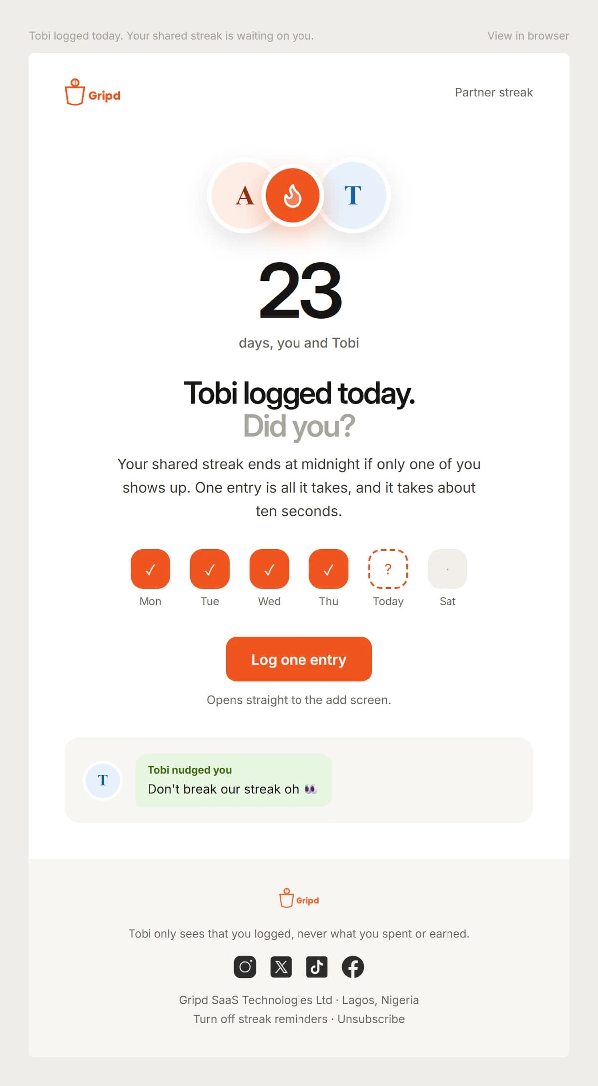
"Tobi logged today. Did you?" The partner streak email turns a reminder into something social: 23 days together, a week of ticks with today's square waiting, and a message bubble from Tobi. It's the kind of email you open because someone is counting on you.
- 5
Built to actually send
Every email is 600px wide, lives on one shared stylesheet and uses Gripd's real palette, with a preheader written for the inbox preview line. Each footer says what the person can see and why they got the email, and offers a way out. Trust is part of the design.
Up close
What I learned
A small system the team can reuse for every future email: one header, one footer, one voice. Writing the copy alongside the layout is what made them feel like Gripd and not like a template with a logo swapped in.
seen enough? there's more where this came from
See the full project on Behance↗