case study
Drive Ease Brand Identity
Full brand identity for an automotive parts store: logo, colour system, typography and how it all works across digital and print.
- Client
- Drive Ease Auto Parts Store
- Role
- Brand designer
- What I did
- LogoColour systemTypographyBrand guidelines
The brief
Buying car parts in Nigeria usually means guesswork, stress and a long drive to a market. Drive Ease's name already promised the opposite. The identity had to make that promise look believable.
How I got there
- 1
Hide the idea in a letter
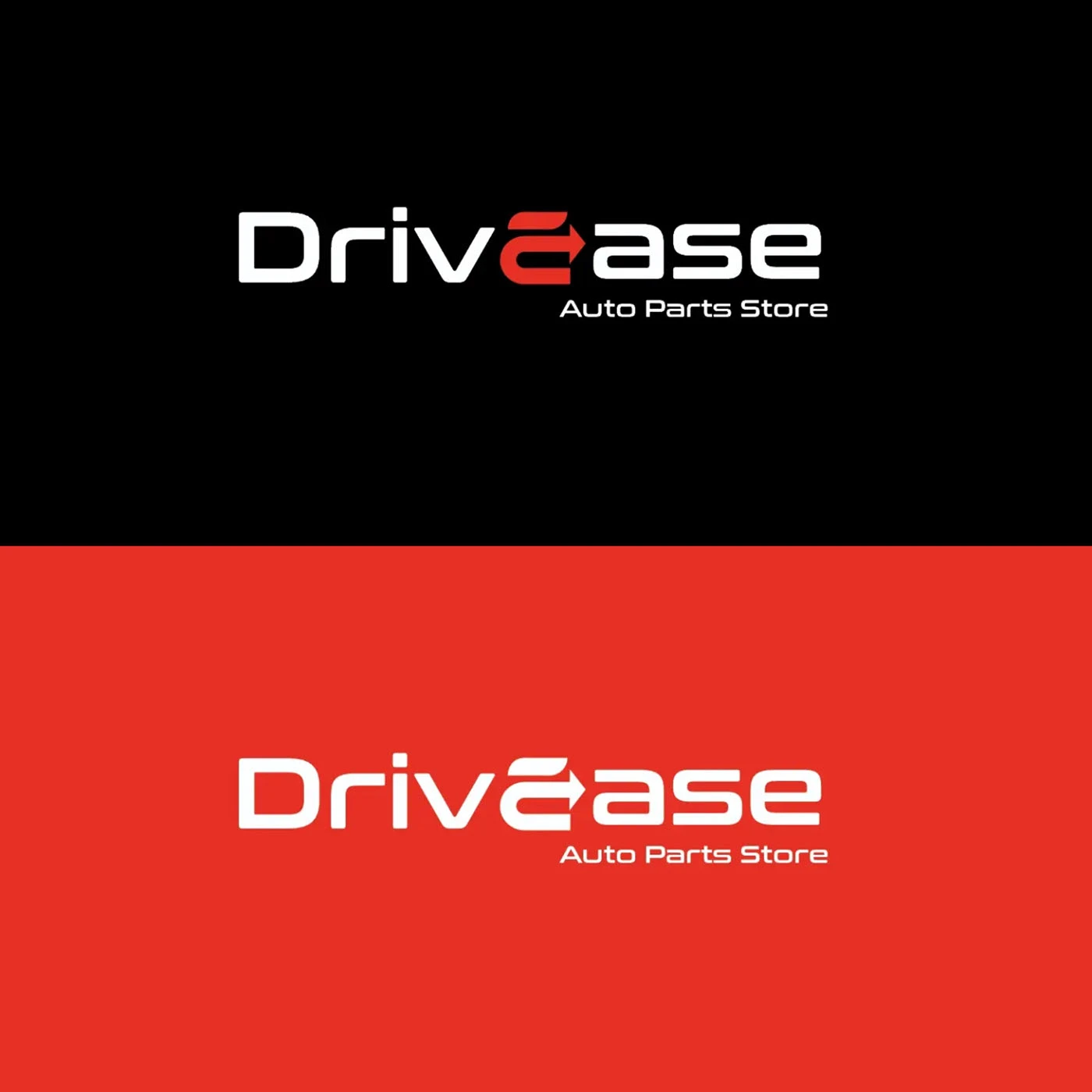
The "E" in Drive Ease turns into a curved arrow, a road taking a smooth turn. It's the whole brand in one character: movement, made easy.
- 2
Two colours, no confusion
Black and a strong red. Red for speed and urgency, black for the serious, reliable side of the business. The logo works reversed out of both, which matters for signs and stickers.
- 3
Type that looks engineered
A wide, squared-off typeface with soft corners feels technical without feeling cold, closer to a car dashboard than a spreadsheet.
- 4
Built to be used without me
I set up the colour system, type rules and how it applies across digital and print, so the team can make new material on their own.
How it landed
A complete identity the store can take from shop sign to Instagram post without changing its voice.
seen enough? there's more where this came from
See the full project on Behance↗