case study
AfriSwap Branding
Brand identity and marketing assets for AfriSwap, plus promotional and instructional video content for customer-facing channels.
- Client
- AfriSwap, Lagos
- Role
- Visual designer & video editor
- Year
- 2024
- What I did
- Brand markMarketing assetsVideoMotion
The brief
AfriSwap is a swap platform built for Africa. They needed a mark that said "African" without leaning on the usual clichés, and then a steady stream of content to explain the product to first-time users.
How I got there
- 1
Africa, folded
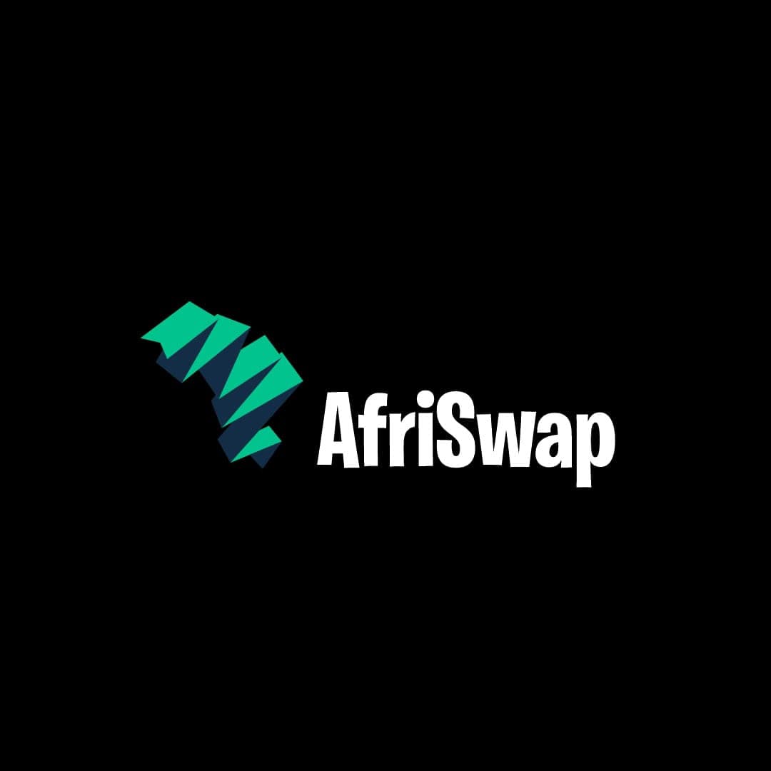
The mark is the continent built from folded, paper-like planes in green and navy, a map you could imagine making by hand. It reads as Africa from across a room and as an abstract shape up close.
- 2
A wordmark that shouts
A condensed, heavy wordmark, white on black, so it holds up as a tiny app icon and on a billboard.
- 3
Then the content machine
Over four months I produced 25 promotional videos, posters and graphics, plus instructional videos that walked customers through the platform so they didn't need support for the basics.
- 4
Feedback in, assets out
If customers kept asking how something worked, the next video answered it. I worked with product and marketing to turn real questions into visuals.
How it landed
A recognisable mark and a content library that cut down basic support questions and kept the brand consistent everywhere it showed up.
seen enough? there's more where this came from
See the full project on Behance↗