case study
Blue Harvest Brand Identity
Logo and identity for an agritech startup helping farmers and sellers with productivity and supply chain.
- Client
- Blue Harvest
- Role
- Brand designer
- What I did
- LogoBrand markColour
The brief
Blue Harvest is an agritech startup helping farmers and sellers with productivity and supply chain. Farm brands usually look either rustic or corporate. This one needed to look like technology that actually understands the farm.
How I got there
- 1
A plot of land, seen from above
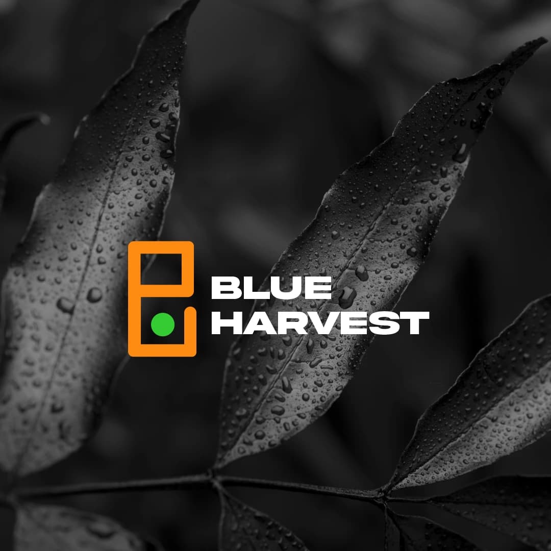
The mark is an outlined field, orange like soil in the dry season, with one green dot growing inside it. One seed, one plot, one harvest.
- 2
Modern, not rustic
A bold, wide wordmark keeps it in tech territory, so it sits comfortably next to the apps and dashboards the company builds.
- 3
Colour that tells the story
Orange for the land, green for growth. The palette explains the business even when the logo is tiny.
How it landed
A simple, ownable mark that explains the business at a glance and scales from an app icon to a sack of produce.
seen enough? there's more where this came from
See the full project on Behance↗