a personal one ✦
Ilé Coffee Roasters
Specialty coffee that feels like a neighbour's kitchen, not a private club.
- Client
- Personal project
- Role
- Everything
Why I made it
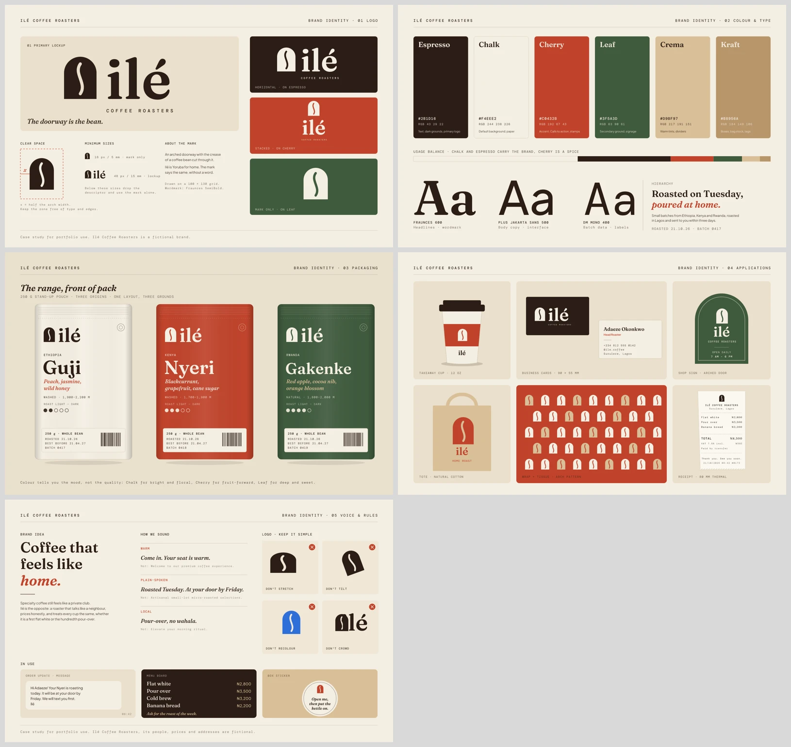
Specialty coffee has a way of making people feel like they ordered wrong. I wanted to design a roaster that feels like a neighbour's kitchen that just happens to roast very, very well. Ilé is Yoruba for "home", and that word did most of the strategy for me.
How I got there
- 1
The doorway is the bean
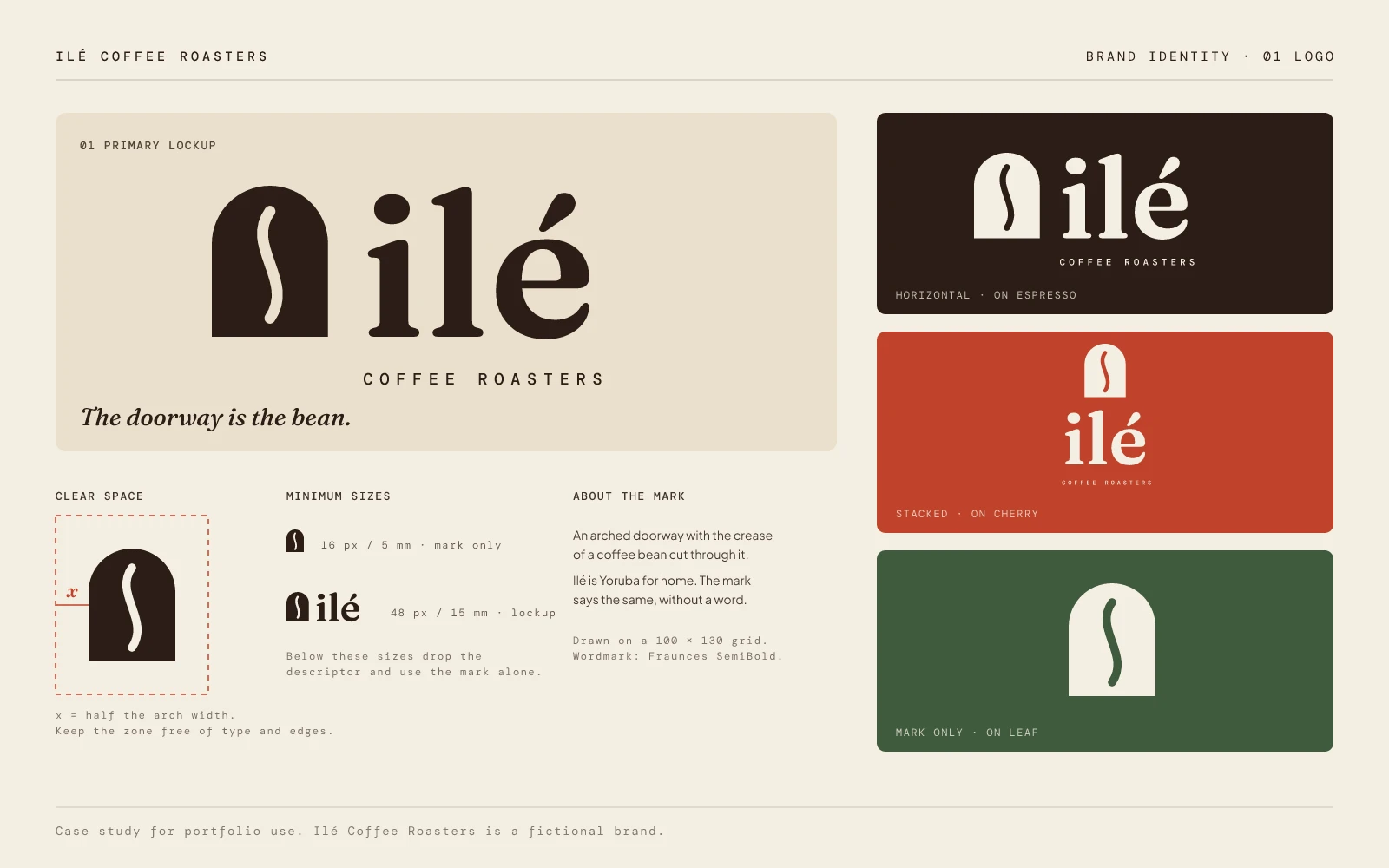
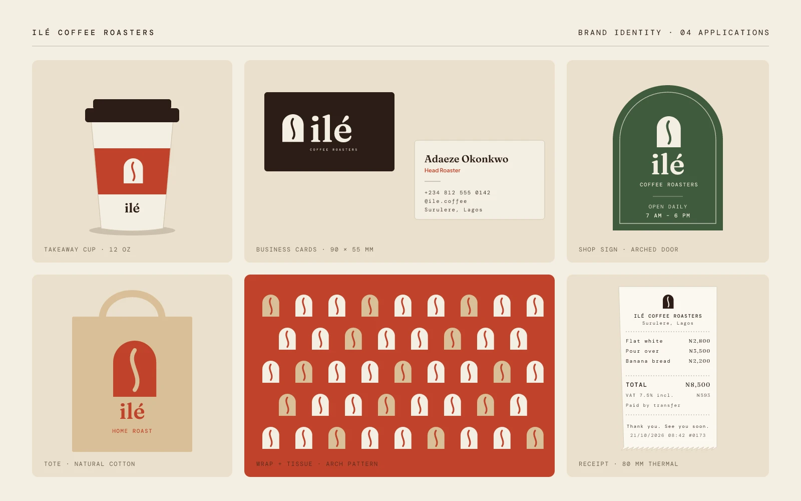
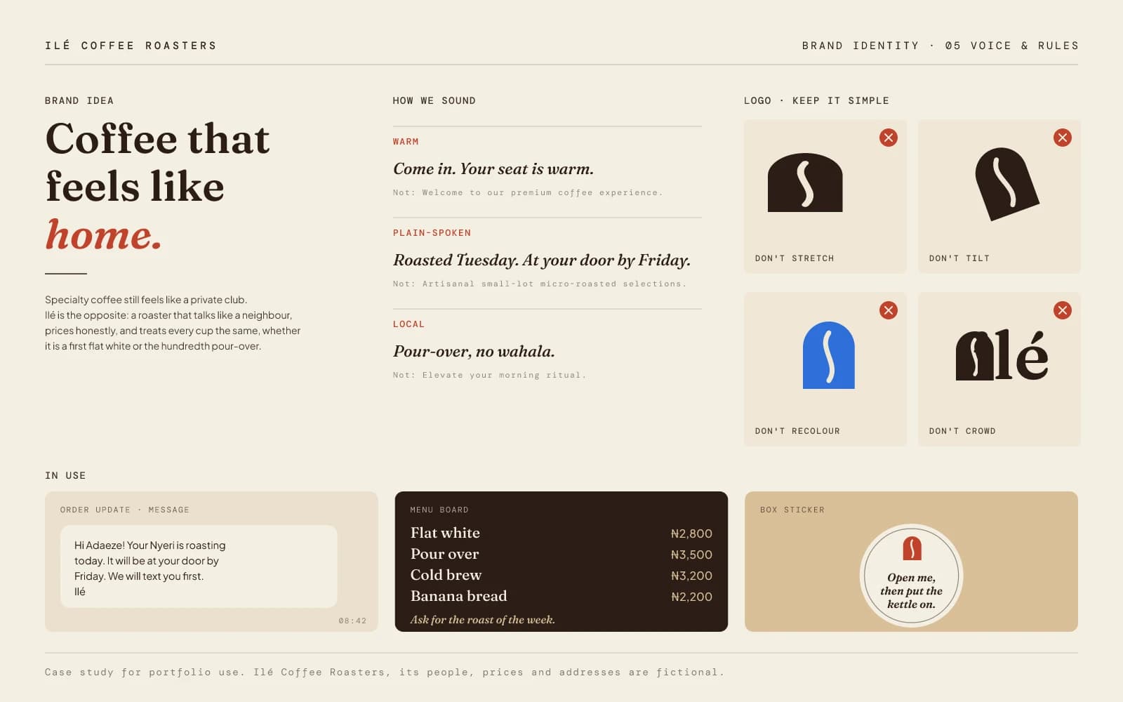
The mark is an arched doorway with the crease of a coffee bean cut through it. One shape, two readings, no explanation needed. Once that clicked, the arch became the whole system: the shop sign, the wrap pattern, even the cut-out on the bag.
- 2
Keep the accent honest
The wordmark is 'ilé' in lowercase Fraunces, accent included. Dropping it would have been easier to typeset and wrong to the language.
- 3
Cherry is a spice
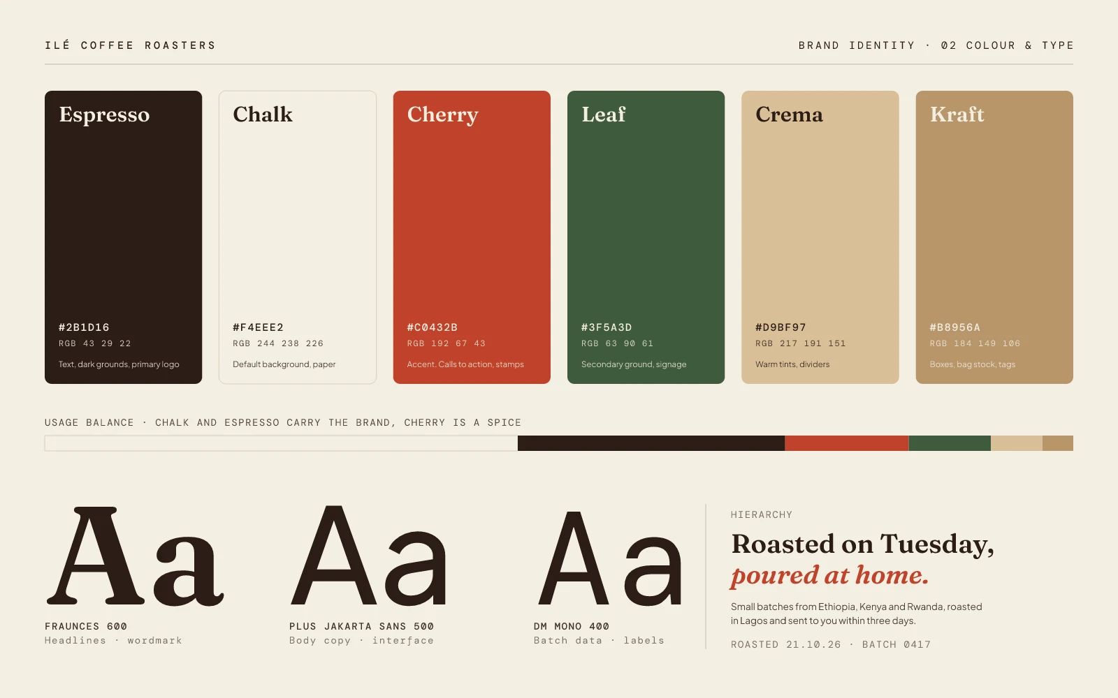
Espresso and chalk carry the brand. Cherry, leaf, crema and kraft support it, and cherry stays at around 12% so it always feels like an occasion.
- 4
Colour tells mood, not quality
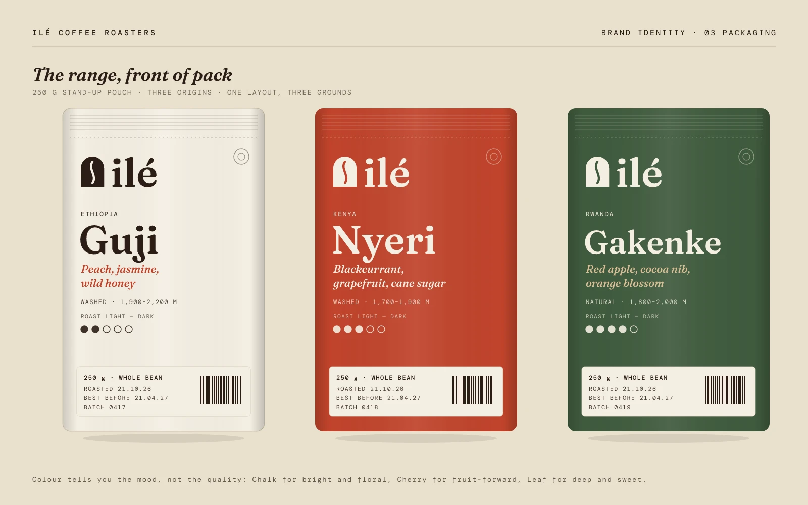
One bag layout, three grounds: chalk for bright and floral, cherry for fruit-forward, leaf for deep and sweet. Only the origin, tasting notes and roast dots change, and batch data sits in mono so every bag feels traceable.
- 5
Talk like a neighbour
'Come in. Your seat is warm.' 'Pour-over, no wahala.' Each line is written next to the stiff corporate line it replaces, so the team can see the difference, not just be told about it.
- 6
Sweat the boring details
The bags have a crimp, a tear line, a valve and a batch sticker. The receipt uses real Naira formatting and correct 7.5% VAT. Details like that are what make a fictional brand feel like somewhere you could actually walk into.
Up close
What I learned
A brand that can scale by origin (Guji, Nyeri, Gakenke) without ever needing a redesign, and the project I point to when someone asks what 'one ownable shape, applied with discipline' looks like.
seen enough? there's more where this came from
See the full project on Behance↗